I was in a convenience store in Poznań, Poland, when it happened. Not looking for fabric inspiration, just looking for water. But the shelving, the packaging colors, the way the light hit a display near the door… I pulled out my phone, took a picture, and had a palette in under a minute. Those colors eventually found their way into a quilt.
That’s the thing about color inspiration: it doesn’t announce itself. And the phone already in your pocket is a surprisingly powerful tool for capturing it before it disappears.
AI-powered color apps have gotten genuinely good. The trick is knowing which ones are worth your time and how to use them for fabric — not just graphic design or home decor.
Start with a photo
The most practical entry point is photo-based palette extraction. Point your phone at anything — a tiled floor, a farmers market stand, a fabric you love, a convenience store in Eastern Europe — and the app pulls the dominant colors into a usable palette. That becomes your starting point.
The apps worth knowing
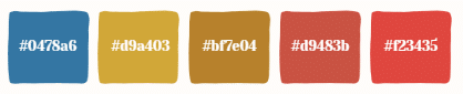
Coolors (free, iOS and Android) is the one I reach for first. Use the camera mode, point it at anything, and it builds a five-color palette in real time. You can lock the colors you want to keep and regenerate the rest around them — which is perfect for “shopping your stash.” Lock in that one green you’re committed to and let it find four fabrics that could work alongside it.
ColorSnap by Sherwin-Williams (free, iOS and Android) is technically a paint app, but it’s genuinely useful for quilters. It identifies colors from any photo and shows you undertones — which is exactly what you need when you’re trying to figure out whether that “sage green” reads warm or cool next to your other fabrics.
Adobe Color (free, iOS and Android) is the most powerful free option when you’re building a palette from scratch rather than a photo. Work from color wheel rules — complementary, analogous, triadic — and see what the relationships look like in practice. The “Color Accessibility” mode flags low-contrast combinations, which matters when you’re thinking about value in a quilt.
Canva has a photo-to-palette feature in its mobile app as well. Less nimble than Coolors, but useful if you’re already working in Canva for other design tasks.
An honest note
These tools are smart, but they don’t know fabric. They don’t know that a print reads differently from two feet away than it does up close, or that your batting choice affects how the whole thing photographs. Use them to get oriented and build a direction. Then bring your actual fabric into it. The app is a starting point, not the last word.
Your eye still closes the deal. But it’s nice to have a little AI backup, whether you’re at home in your sewing room or standing in a shop in Poland.
Want to try this in person?
I’m teaching Color Confidence: Build a Palette Inspired by Anything In 20 Minutes at the Fiber+Fabric Craft Festival — April 30–May 3, 2026 at the Donald E. Stephens Convention Center in Rosemont, IL.
In this one-hour hands-on session, you’ll use your own phone and your own camera roll to build a quilt-ready palette from scratch. No special equipment, no color theory background required. Just bring a photo that moves you — a vacation snapshot, a meal, a storefront — and we’ll turn it into something you can actually sew.
“This was such a cool class! I loved seeing how I can use my pictures to create color palettes and honestly it helps for so much more beyond quilting!” — Jim H.
Register for Color Confidence at Fiber+Fabric Craft Festival →
For More About Color and Design
There’s a whole section about color and design on my blog. Check it out.